
|
I have been fiddling around for a while with ideas for a new personal logo. Everything was coming out pretty boring and generic so I decided to make it more personal and draw influence from my two favorite things: Russian folk art and fairy tales. I looked at illuminated manuscript images such as the ones below, because they reminded me of the illuminated first letter of a chapter in old story books: 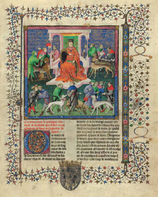
Source: http://www.nytimes.com/imagepages/2008/04/18/arts/18morg_CA1.ready.html I also looked at objects painted with Khokhloma (which I have all over my house). Khokhloma is a wood painting technique, where floral and sometimes animal patterns are painted on a black background with red, green, and gold. Khokhloma is usually painted on wooden objects, especially tableware. 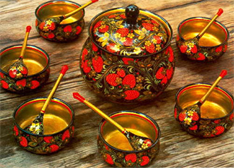
Source: http://tveruzor.com/_EN_RussianCrafts.php I also drew influence from gothic lettering, because I like their fancy scroll look. Anyway, this is what I came up with. The V was especially challenging because a regular V shape that we are all used to just did not look good in a square, so I had to use the gothic version with a straight side. I will probably tweak it some more later but for now I am pretty content with it: 
Some color versions. The first one is in the traditional Russian Khokhloma colors and the second two are some variations. 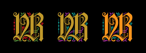
0 Comments
I recently had the pleasure of redesigning the Breathing Room Yoga Center logo. I went for a classic, clean look with this one. The heart that is the B represents love, trees, life, breathing, lungs, etc. 
Here are some other variations of the logo: 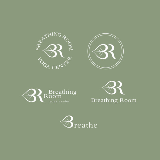
The "Breathe" version, which is on the new t-shirts sold at the yoga center, is one of my favorites. If you are in the New Haven area, go take a class at Breathing Room! You will feel refreshed and rejuvenated, I guarantee it.
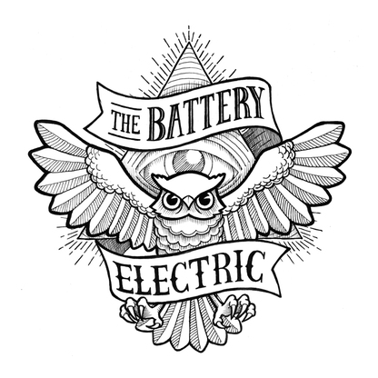 Here is the final product of an illustration I made for my friend's band. I posted the sketch a little while back, and it has changed quite a bit since then. The challenge was making it balanced, since the banner is not symmetrical. I think it worked out pretty well!
Time to go work on my next project! 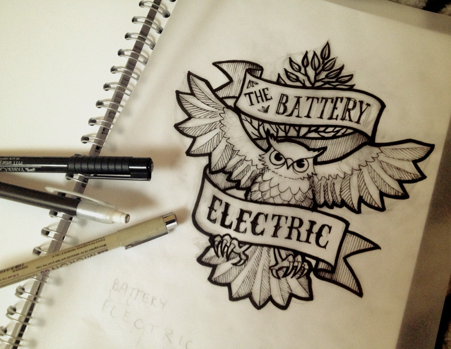 Working on a little illustration for my buddy Brent and his new band, The Battery Electric. Going for kind of an old fashioned, American, tattoo style. This is just the first version, as there are still lots of things I want to change. I will post the final one (hopefully) soon!
Soon I will post pictures of some of the other fun projects I'm working on! |
|
For sales or licensing inquiries, please email vasilisa@vasilisaart.com
|
|
All images, designs, and artwork are © 2017 Vasilisa Romanenko. All Rights Reserved.